Fresh april
INSPO, IDEAS, AND STORIES BEHIND THE WORK
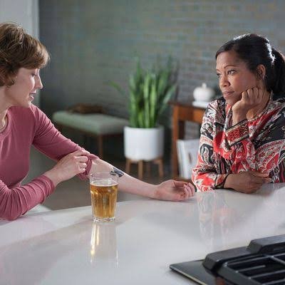
The Leftovers: Nora gets a W tattoo to cover up the tattoo of her childrens’ names, a painful reminder of their disappearance. Also, watch the Leftovers.
Wu-tang BRAND ain’t nothin’ to f*ck with
We got a surprise from my huband’s work partner company, free box-seat VIP tickets to see Wu-Tang Clan, with Bone Thugs-N-Harmony opening.
Bone was some low-end fun. It brought me back to freshman year in high school. And anytime someone passed away, that was the anthem. Sorry, depressing note.
I had always liked Wu casually. And I thought it was hilarious in The Leftovers on HBO when Nora got a Wu-Tang tattoo to cover up her emotionally painful tattoo.
Ok, back to my point.
Seeing the concert was, like, bad. ass. fun.
Nine rappers, a bunch of musicians including horns, a conducter, bass, amazing singers. Here’s what got me, though:
The amazing brand.
I CAN’T HELP IT. I AM A NERD.
But the brand was just so poignant and so ON, and it saturated through everything.
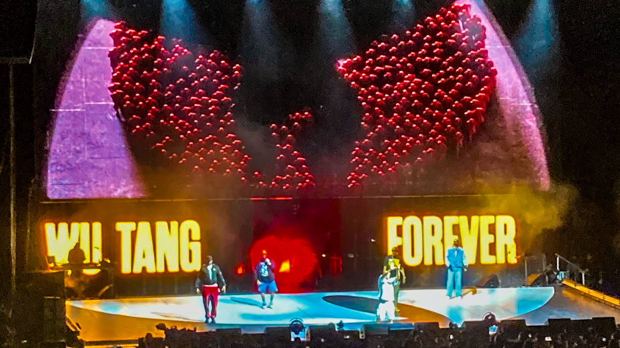
The logo on stage was above the band, and words flashed up in a deadpan comic font, yellow with a red stroke. The crowd shouted the words on stage and it was just a riot. During the show, they featured the artists inside the W logo, mirrored. I was like, I want to watch all concerts like this.
That W is ridiculous. It can be a logo, a frame, a stage element, a piece of jewelry, a clothing graphic, an icon, a mask. It’s basically anything and you still know exactly what it is. That is kind of the dream with a brandmark.
Each member had great branded attire. A couple of audience members got some blingy Wu gloves from RZA, and those two people are now supposed to get married according to him.
Not only did we get a treat and a history lesson where RZA paid tribute to fallen rappers and did cover teases, we also got to see Ol’ Dirty Bastard’s son carry on his torch.
I also didn’t know until recently that Oliver “Power” Grant passed away earlier this year. Power helped fund some of Wu-Tang Clan’s early recording efforts and later became a huge part of extending the brand through Wu Wear. It makes so much sense when you look at what Wu-Tang became.
It’s samurai, gangsta, funny, worldly, street, and just bad-ass.
It all lives in the same universe: kung-fu movies, aliases, the typography, the yellow and black, the W, the clothing, the imagery, the language, the mythology. None of it feels randomly pasted on. The branding feels like part of the storytelling.
Wu-Tang didn’t just make music with a great logo. They built a whole ruckus universe.
Somehow that universe has stayed recognizable for more than 30 years without feeling frozen in time. The visuals can change, the members can have their own identities, the merch can get remixed, the stage design can evolve, and you still know immediately: it’s Wu-Tang.
I think Power and RZA and the rest of the group have always had a great sense for brand, and it just makes the concert experience that much more exclusive and fun.
The concert felt like a Tarantino film, and I guess that makes sense. RZA worked on Kill Bill, and during an intermission we got a trailer for a new film project in the works (unless I interpreted that completely wrong).
So, I know this is a nerdy little article from a dork mom in the suburbs who went to a Wu-Tang concert and came home thinking about brand architecture.
But honestly, they converted me into a lifelong fan.
I didn’t know how to design a giant visitor center…
but I did it anyway.
As the senior designer at Unbound, something landed on my desk, that I didn’t expect.
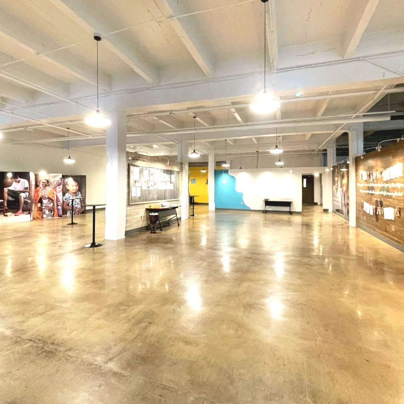
Ideas had been swirling for a while about using our massive warehouse space for something, anything. It seemed like an unused asset. We had a couple of new people show up in leadership for PR and Marketing, and they contacted the amazing company Dimensional Innovations here in Kansas City, Kansas.
Some plans and floor plans were created. And then one day, it became my responsibility. I had experience working on exhibitions from my Mid-America Arts Alliance days, and no one else on our team had really done anything like this. I WAS READY. I really wanted to do it, I love doing large format work and designing spaces. And I wanted to impress newly appointed leadership (I didn’t but … keep reading).
Here’s where the challenges started. The expectation was this would take a couple of weeks, just slap images on a wall and done. That’s not how this works.
First, the spatial plans were designed before any sort of content was outlined or script was written. I tried to introduce how an exhibition script should work, but it was a real struggle when the walls and 3D features were already created. So we had to sometimes force a square into a circle.
I was working on a 2013 iMac. Just to super impose images on a wall in photshop took forever Then I had to get 17 by 20 foot graphic images with outlined text (aka rasterized, not vector, AKA PPI hell), took forever to load and then edit. I would go have a walk or coffee while thingd were loading. I had no 3D software. So I opened up Illustrator and got my tape measure and made floor plans. I mapped out lighting and electrical as well as wall graphics and standing 3D features. Then i painted and edited my little heart out in Photoshop to show visual mockups of the space. My computer sucked and everything took so long, If I were to do this today on my mighty little Air, no biggy.
Then each section required photos that could work at 17 by 20 feet. So while we had many photos to choose from (thanks to me implementing a DAM and our reporters gathering amazing content), a lot of them wouldn’t work at that size even though large format printing requires fewer PPI. I took images of the space and presented photos superimposed on the walls. This was before AI folks.
Nothing ever seemed fast enough or good enough. Pille on that I had a newborn baby sitting in daycare all day and keeping me up all night, after being bedridden for 5 months. I had to turn my 2 month old baby over to a stranger because I ran out of coverage and money. The struggle was real and real hard.
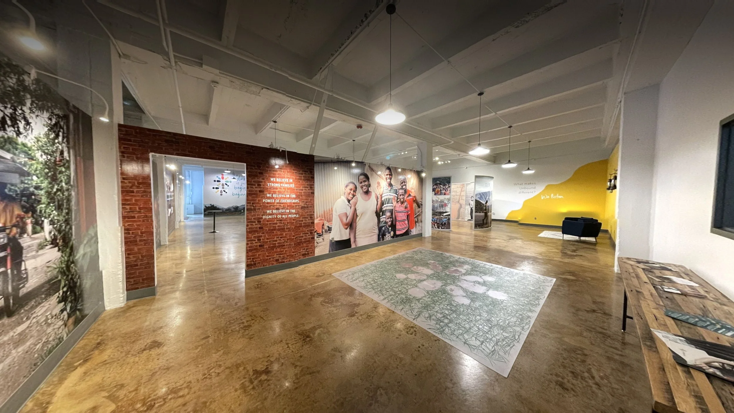
Moving on, I helped form the structure and edit the stories on the walls to go with the images. The design started to come to life and soon my pals at Custom Color (they got bought out but they were amazing and Design Ranch did their branding) expertly and precisely got those walls up so fast.
In Latin America, it’s tradition to lay out pine needles almost like a red carpet for guests, so I made a large pine needle printed garage mat for the entry way.
And more hands-on work happened. I hand installed moveable lights on each wall, edited music and sound for motion activated speakers, which I installed throughout the space. I added authentic gas lamps to our India section (got loads of compliments from staff that frequently travel to India, but leadership called it cheesy). I hand applied vinyl lettering and picked out Benjamin Moore paint customized to our Pantone swatches. I installed wayfinding signage. I assisted the electrician in a floor map of where to put boxes but also helped them install the boxes and overhead lights. I picked out the ceiling and flooring treatment.
The space was finally complete. And staff was exploring it during their breaks and we were beginning to hold gatherings. And when announcements were made, many people noticed that I was almost not mentioned at all in the ‘thank you’ section. I will be honest, it hurt. And then the pandemic happened and that was that for a while.
But now I take heart. It was something I had never done before, and I did it, and I made it awesome. The space continues to be used. It was tough and I didn’t impress the guy I wanted to. But that’s ok. I later learned that a lot of people recognized the value of my work and I enjoy seeing it grow and featured on social media to this day.
SUMMARY
I had never designed a multi-thousand-square-foot visitor experience before, but apparently experience was optional and I had been selected as tribute. Armed with a 2013 iMac, Illustrator, a tape measure, very little sleep, and an unreasonable amount of audacity, I somehow designed walls, floors, lighting, sound, signage, electrical plans, giant graphics, and basically whatever else needed doing. So, no, I didn’t know how to do it (and yes, I got barely any credit) but the space is still being used today, which feels like a pretty solid plot twist.
Smashing branding
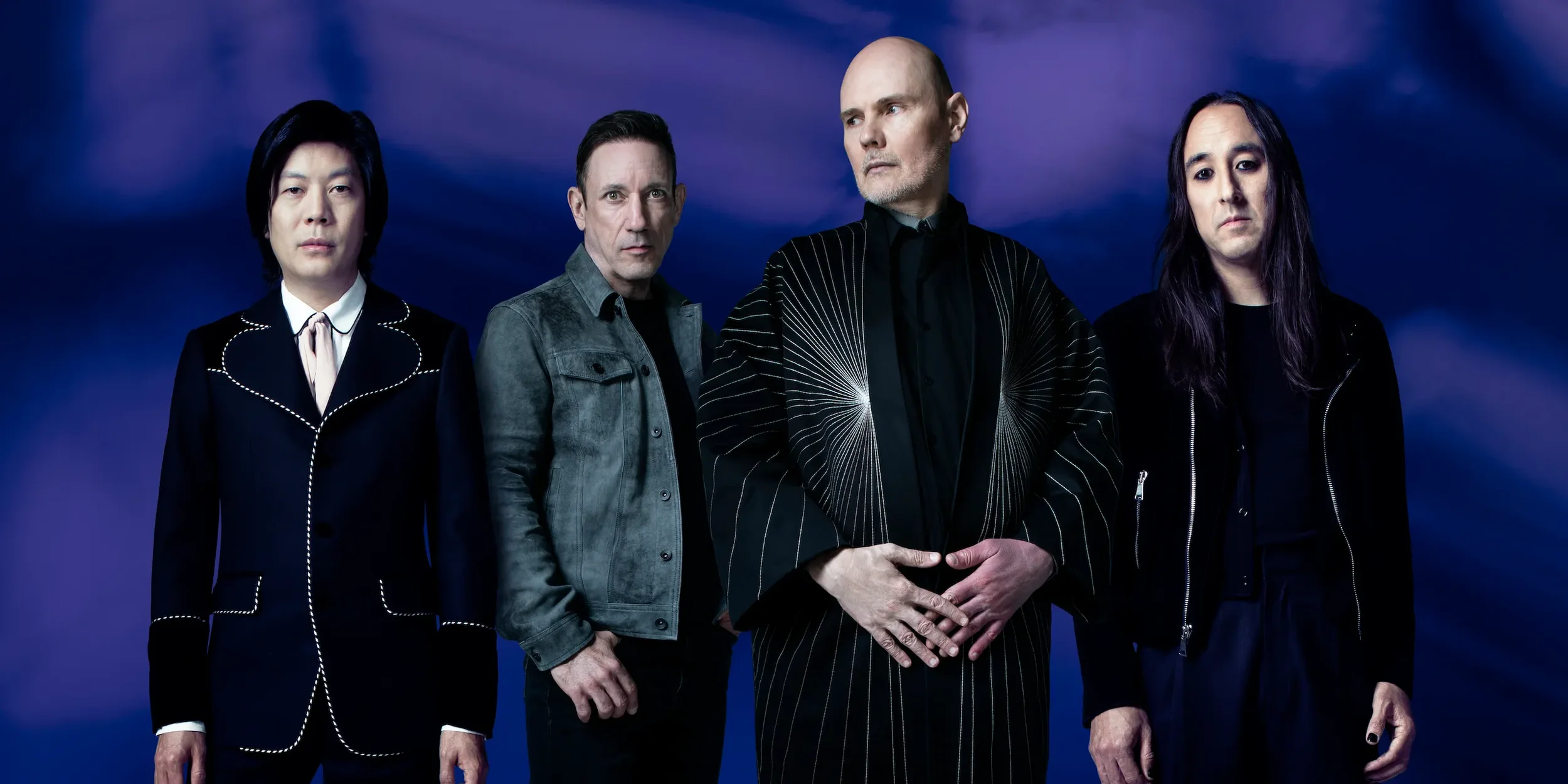
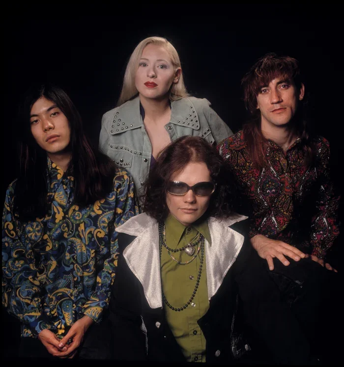
Can we talk about the Smashing Pumpkins for a sec? If you know me personally, you know I have been a die-hard fan of their cosmic alt-rock sound since I was 15 years old. Here I am, way older (wink), and they are not only intact but still rocking it, growing fans and marketing themselves like crazy.
Everyone was talking about Yungblud and Olivia Rodrigo joining them on stage at Lollapalooza. And I never thought I would be saying that in 2026!
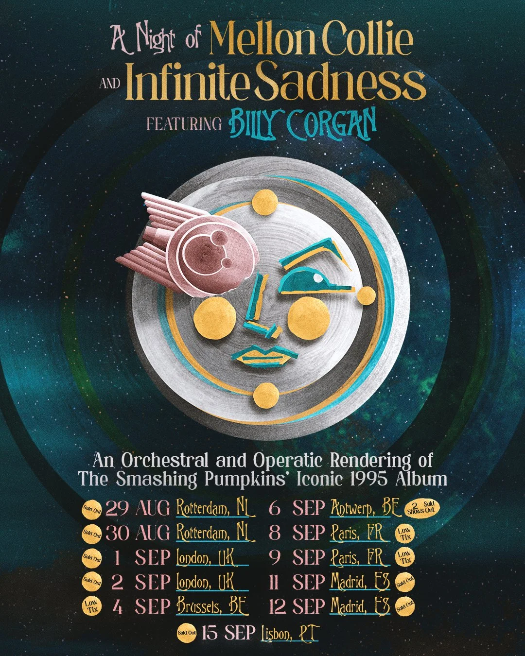
I was so wanting to go to the Infinite Sadness Opera. And from a branding perspective, I love it. They are breathing life into old content to make something new and engaging, but also artistic and high-quality. It doesn’t feel like, “Hey, remember this album from the ’90s?” It feels like, “Here is this thing you already love, but we are going to make you experience it in a completely different way.”
And that is something I think they do really well. They don’t run away from the old stuff, but they also don’t just keep reheating it. They know what parts of the brand people love—the stars, the moons, the weird Victorian imagery, the melancholy, the drama, the Zero shirts, all of it—and they keep finding new ways to use those things.
Then you have Madame Zuzu’s, the teahouse/rock merch paradise, which is basically its own little extension of the Pumpkins universe.
WPC bringing his kids on stage makes every show feel like family for us long-term fans. It reminds you that there are actual people and history behind all of this, which is probably why so many fans have stuck around for decades.
Then the Magnificent Others podcast, featuring some of the greatest, and some controversial, figures in rock and entertainment. That gives Billy yet another place to exist outside of just “guy from the Smashing Pumpkins.”
Limited edition merch, old artwork, vinyl, archive stuff, little collectibles. They clearly understand that their fans don’t just listen to the music. We collect the world (is a vampire) around it. And now mostt of us are old enough to actually maybe afford the box set.
I also think they have done a really smart job of reaching younger audiences without suddenly trying to act young. Bringing people like Olivia Rodrigo and Yungblud into the mix makes sense because you can actually hear the influence. They don’t have to pretend they are a new band. They just have to remind people how much of what came after them has a little Pumpkins DNA in it.
Chicago is part of the brand too. Lollapalooza, Madame Zuzu’s, the opera, the whole city by the lake thing. It makes the band feel attached to a place and a history instead of just floating around doing reunion tours.
My point is: what an amazing feat of marketing and saturation. Love ’em or like ’em, they are still viable, touring and flourishing in a radically different time than the ’90s.
That is the real branding lesson. A good brand does not need to stay frozen in the exact form people first loved. You just have to know which parts are beloved, which parts should grow and which parts you can weird out.
The Smashing Pumpkins have basically turned 35+ years of music, visuals, mythology, merch, nostalgia and occasionally very weird decisions into one constant and living brand.